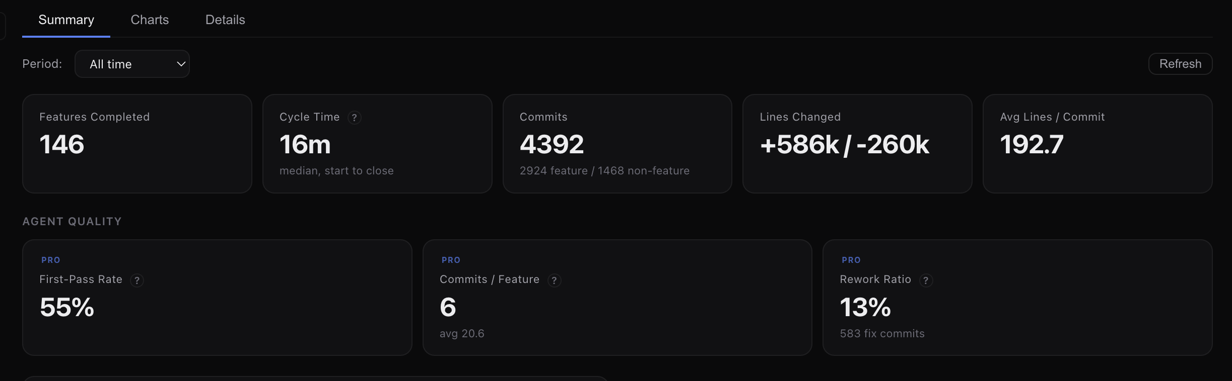
The Insights tab in the dashboard builds on the telemetry data the Reports tab already collects, adding quality metrics, token analytics, efficiency trends, and AI-powered coaching.
Overview metrics
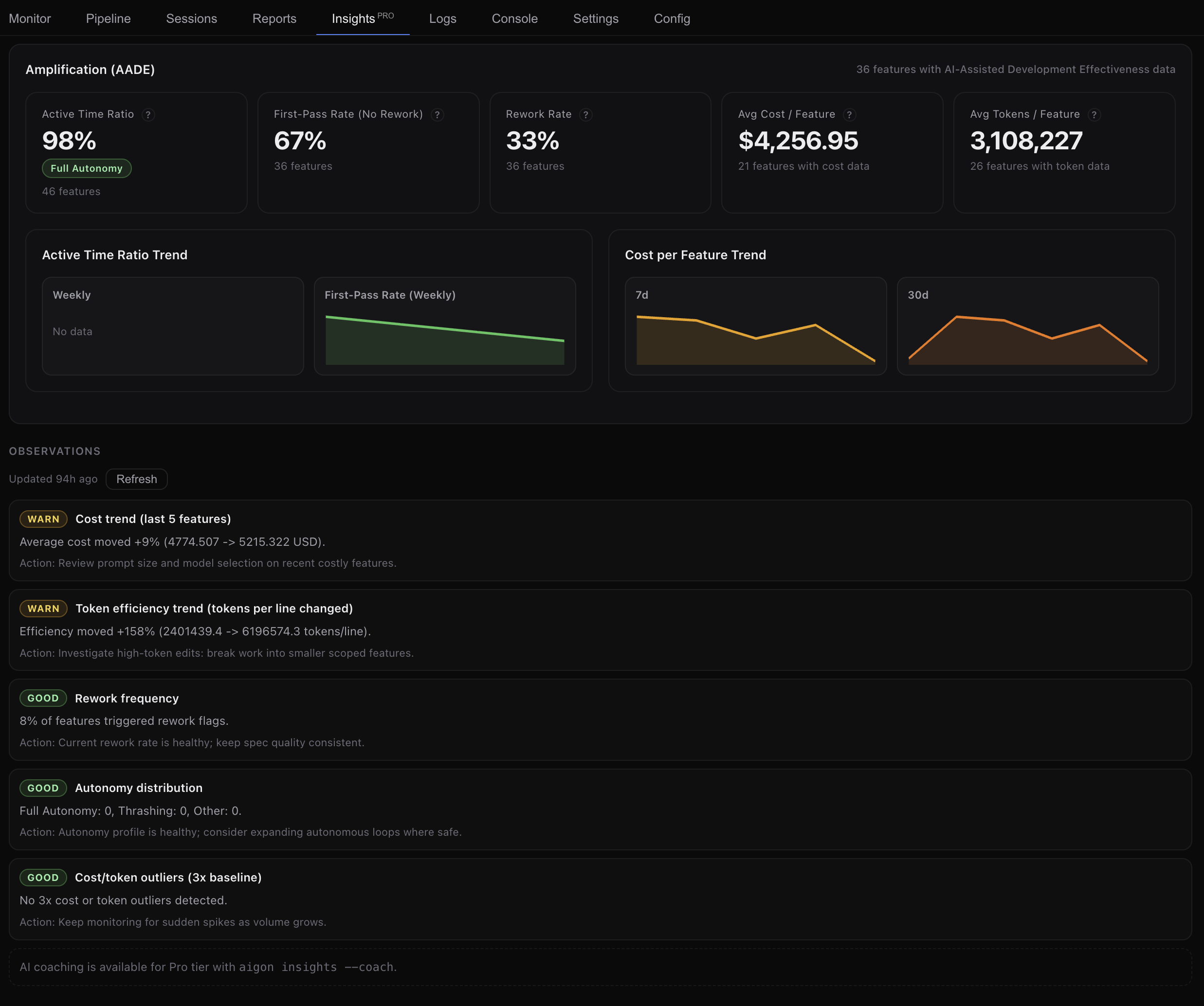
Three headline cards give you a quick read on quality and efficiency:
| Metric | What it measures | Better is… |
|---|---|---|
| First-Pass Rate (No Rework) | % of features completed without triggering rework flags (thrashing, fix cascades, scope creep) | Higher |
| Median Cost / Feature | Median AI compute cost per feature at API list prices | Lower |
| Median Tokens / Line Changed | Median billable tokens per line of code changed | Lower |
Trends
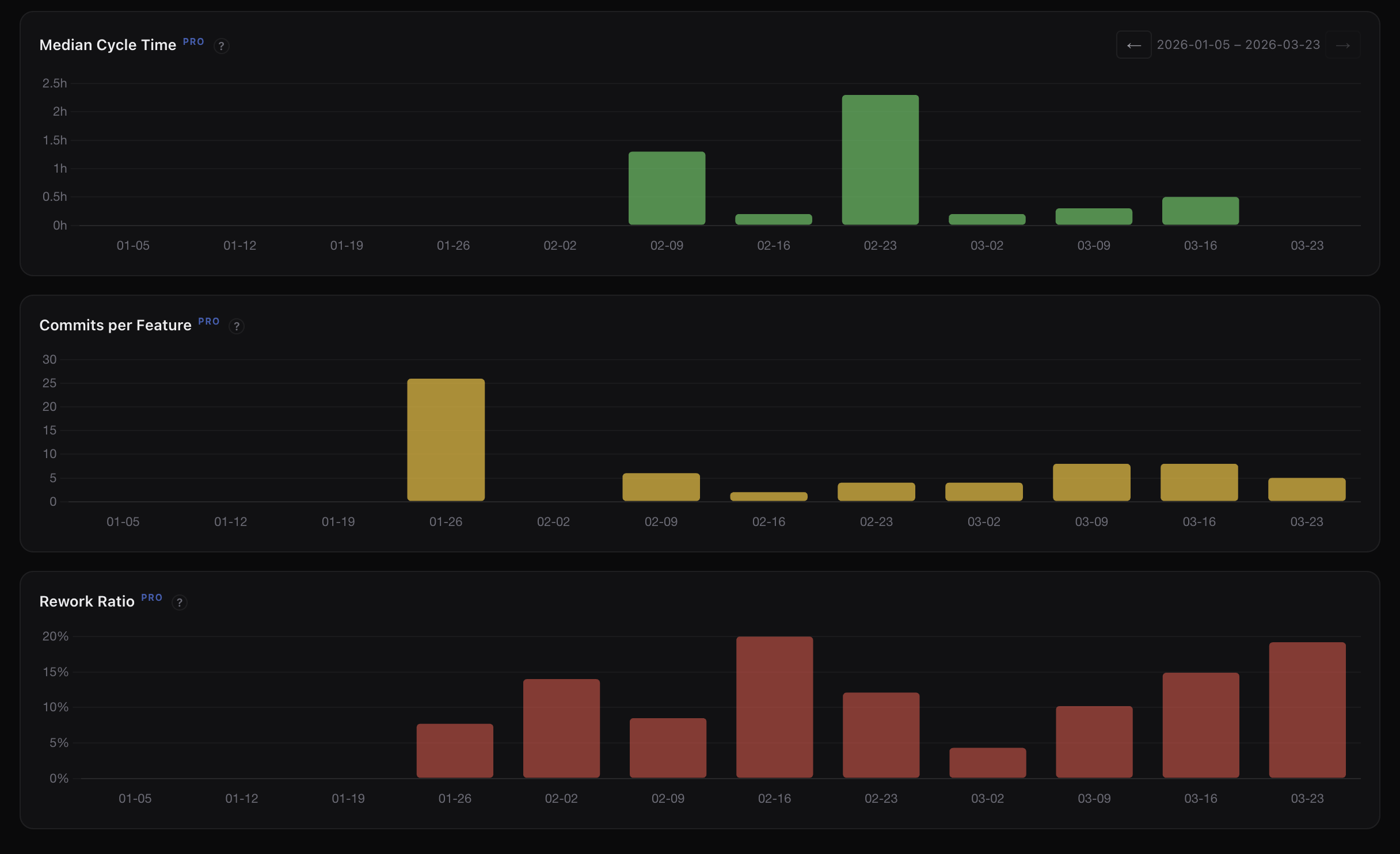
Two sparkline trend panels show 7-day and 30-day direction:
- Cost per Feature — is each feature getting cheaper to deliver?
- Tokens per Line Changed — are agents getting more efficient with tokens?
Token analytics
When features have billable token data, the Insights tab shows a full token analytics section:
- Summary cards — mean, median, P90, and max tokens per feature
- Token Distribution — histogram showing how token spend is distributed across features
- Tokens per Feature Over Time — scatter plot showing token spend trends
- Token Usage by Agent Over Time — stacked bar chart with daily/weekly bucketing
- Token Usage by Activity & Agent — stacked area chart breaking down implement vs. evaluate vs. review tokens
Agent Efficiency table
A per-agent breakdown showing features completed, median tokens, median cost, and median tokens per line changed. Use this to compare agent efficiency and decide role assignments.
AI insights & coaching
The insights panel analyses your recent workflow data and surfaces observations and actionable recommendations about your workflow patterns, agent performance, and cost optimisation opportunities.
How data flows
Agent sessions → Telemetry parsers → .aigon/telemetry/ → Reports tab
                                                        ↘ Insights tab
The Insights tab reads the same normalized telemetry that the Reports tab uses. No additional data collection is required — if Reports shows data, Insights can analyse it.
When Insights is most useful
The Insights tab shines when you have enough data to spot trends:
- After 10+ features — metrics become statistically meaningful
- With 2+ agents — the Agent Efficiency table reveals comparative strengths
- Over time — sparkline trends need at least a week of data to show direction
For new projects with few features, the free Reports tab provides everything you need.
Next steps
- Telemetry & Analytics — how data is collected and what each field means
- Dashboard guide — full walkthrough of all dashboard tabs
- Fleet Mode — multi-agent workflows that generate the richest data